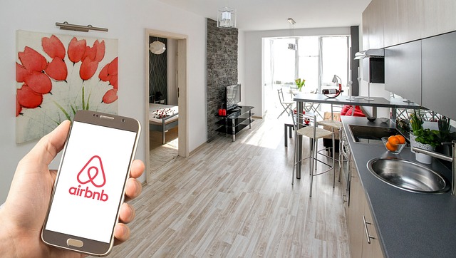
Core features that make research simple
The platform organizes information in a way that is easy to scan and compare. Categories group neighborhoods and practical details, while concise summaries highlight key points such as transit access, nearby parks, cultural areas, and day-to-day conveniences. You can move quickly from broad overviews to specific insights without pop-ups or clutter. Visual cues, consistent headings, and descriptive labels support screen readers and keyboard navigation, helping every visitor find what they need. The interface is calm and predictable, minimizing friction whether you are using a smartphone on the go or a laptop at home. Links guide you to reliable sources so you can verify details and continue your planning with confidence.
Structured navigation
Clear menus and meaningful categories reduce guesswork. Find neighborhood and accommodation ideas with fewer clicks and better context.
Responsive on every device
Layouts adapt to phones, tablets, and desktops. Text remains readable and controls stay reachable at all viewport sizes.
Accessibility first
Color contrast, keyboard focus states, and semantic headings help ensure a smooth experience for assistive technologies.
Modern, calm UI
A balanced blue and green accent palette keeps the focus on content. No aggressive elements or intrusive overlays.
Informational support
Concise descriptions and helpful links guide you to credible sources so you can verify details before planning a visit.
Privacy-aware
Cookie preferences let you control analytics and marketing. Only essential cookies are active until you consent.

Accessibility and inclusive design
Accessibility is built into the structure of the site. Headings follow a logical order, interactive elements include visible focus states, and color choices meet WCAG AA contrast guidelines. Forms rely on native HTML validation, while ARIA attributes help communicate status messages to assistive technologies. Keyboard users can move through navigation and content efficiently, and the burger menu provides a clear path to essential pages. Alt text is added to images so screen readers can describe visuals that provide context. Our aim is to remove barriers and support consistent access to information for the widest range of visitors.
Device-ready performance and clarity
Pages are designed to load quickly and adapt smoothly to different screens. Media is lazy‑loaded, images scale with object-fit to maintain quality, and layouts use a mobile‑first approach so content remains easy to digest on smaller devices. The visual hierarchy highlights titles, summaries, and calls to explore further, while spacing keeps sections readable without feeling dense. We avoid heavy scripts and remove elements that can distract from research, such as auto-playing media or obstructive pop-ups. The result is a calm environment where you can scan, compare, and decide what to explore next.

Important information
The features described on this page are provided for informational purposes. We do not guarantee outcomes or availability, and details may change. Always confirm information with official sources when planning travel or accommodation. No professional advice is offered on this site.